Dagon's Barrow (Chainsaw-inspired Mega-dungeon design thread)

Skip to: New Posts  Last Post
Page:  Next »
Posted by Druvas
4/14/2017 6:26 am
#1

Chainsaw's Foolsgrave has inspired me to design a mega-dungeon in Hyperborea as well. It's been a while since I've done any map-making so I loaded up GIMP and got to work. I have a lot to think about and Chainsaw has given me some good pointers. I'm a huge fan of Stonehell and will probably do map-keying in a similar fashion. I have begun thinking about factions and levels. Here's a brief list:

Factions:

Sub-human Picts, similar to those in the Bran Mak Morn stories
Crabmen
Snakemen
Something akin to Vegepigmies

Levels:

Definitely want a buried spaceship as a level, probably belonging to the crabmen
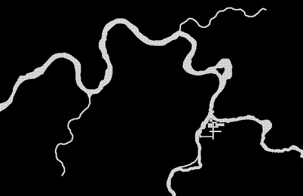
Lazy river with classic dungeon elements (the first level, most likely)
Strange garden

I'll add more over time and am certainly open to suggestions. I think, once it is all done, I'll release it here for anyone to do with as they please. In the meantime, here is the foundation of the first level:


Posted by Ar'Pharazon
4/14/2017 8:59 am
#2

Speaking of Stonehell, I'm a fan of Michael Curtis and have been thinking about grabbing a copy of it. How do you like it?

 
Posted by Druvas
4/14/2017 10:11 am
#3

Ar'Pharazon wrote:

Speaking of Stonehell, I'm a fan of Michael Curtis and have been thinking about grabbing a copy of it. How do you like it?

Ditto. Curtis does some good work. I have a number of his DCC modules and use them in my AS&SH campaign. I love Stonehell and play in a monthly-ish game that's been running for a few years (I'm new to it though). Curtis released a follow up book that covers the bottom half of the mega-dungeon last year, I believe. Such juicy goodness.


Posted by Chainsaw
4/15/2017 10:56 am
#4

Sounds like you are off to a good start! Looking forward to seeing it develop.

Druvas wrote:

Something akin to Vegepigmies

Spore-men?


Blackadder23: Insanely long villain soliloquy, then "Your action?"
BORGO'S PLAYER: I shoot him in the face
 
Posted by Ar'Pharazon
4/15/2017 3:22 pm
#5

Druvas wrote:

Curtis does some good work. I have a number of his DCC modules and use them in my AS&SH campaign. I love Stonehell and play in a monthly-ish game that's been running for a few years (I'm new to it though). Curtis released a follow up book that covers the bottom half of the mega-dungeon last year, I believe. Such juicy goodness.
 

Like I needed it, but this pushes me to getting both Stonehell books. 

 
Posted by Druvas
4/16/2017 4:59 pm
#6

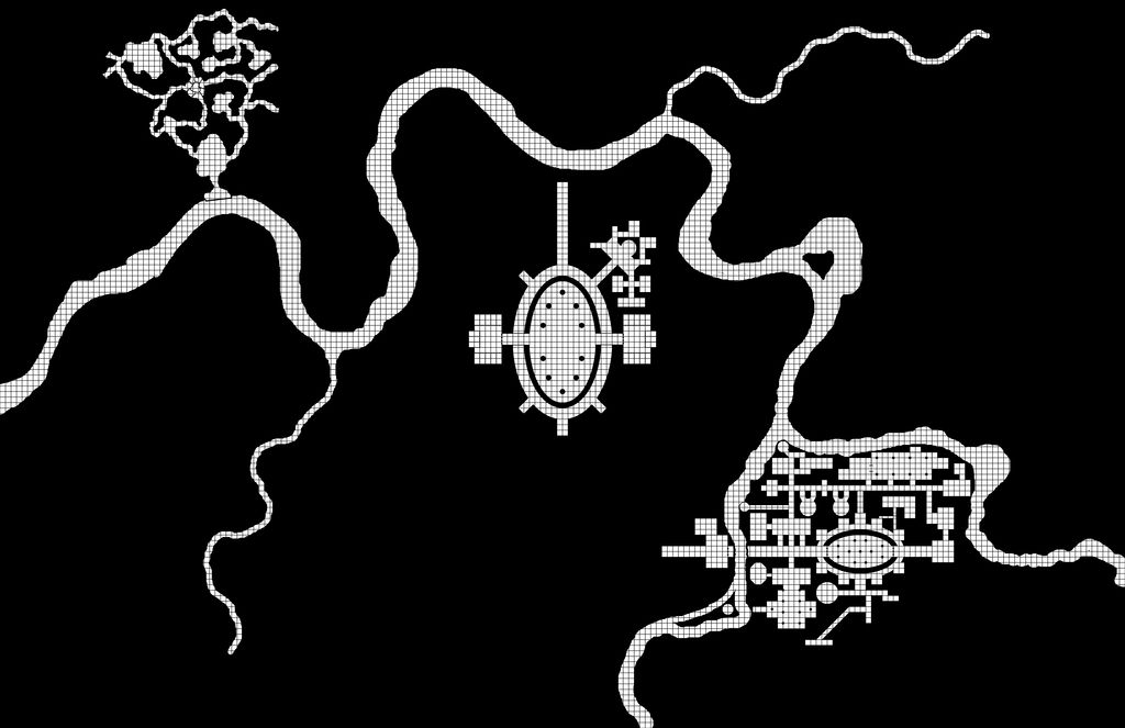
Here's an update. It's been a little slow going but areas are starting to come together. I have some natural caverns to in the north-west that debouch onto the underground river. Added a stone pier at the cavern. Central section is some sort of arena for fighting with lots of seating around the edges. Supporting areas are where different factions or slave owners board their fighters until arena time. South-western section is coming together nicely. Not sure what will make use of that organized region yet!

 
Posted by Chainsaw
4/16/2017 5:11 pm
#7

Very nice, man. I love watching these develop. 


Blackadder23: Insanely long villain soliloquy, then "Your action?"
BORGO'S PLAYER: I shoot him in the face
 
Posted by grodog
4/19/2017 10:40 pm
#8

Looking forward to seeing what you come up with, Charley! :D

Allan.

 
Posted by Druvas
4/20/2017 10:09 am
#9

Thanks Allan!

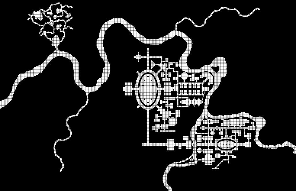
Slow going but here's the next installment.

 
Posted by Druvas
4/24/2017 7:19 pm
#10

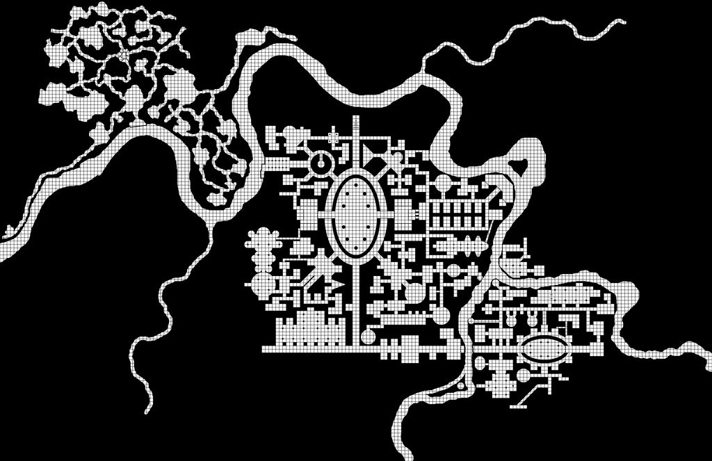
More baby steps. Is this thing too repetitive? Thoughts?

 
Posted by Ar'Pharazon
4/24/2017 10:12 pm
#11

Considering we have the advantage of seeing the entire level in full, sure, there's some repetition and symmetry in the design. It's as if there was some planning in the layout of the thing! 

When your players explore it, they probably won't pick up on those aspects for quite awhile, assuming they even explore the entire level. So, I wouldn't worry about it. I think the design is great. 

 
Posted by Chainsaw
4/27/2017 8:20 am
#12

Druvas wrote:

More baby steps. Is this thing too repetitive? Thoughts?

The only thing that stands out to me is the two ovular areas, but I think these are arena fighting pits, right? So that's not a coincidence. As Ar'Pharazon says, players are unlikely to notice anything without seeing the map as a whole and by then, it won't matter much.

One other thing that I noticed is that you don't have a ton of looping, winding and side-by-side passages, which may be intentional given your vision of this level, I don't know. I found that I grew to like them because it's basically like saying, "If you want to see what's at the end, you have to suffer the wandering monster checks and resource management of traveling this great distance." So, I'd sometimes snake a passage back and forth on itself several times before terminating at either another junction or a room or something. Plus, if the passage switches back and forth a few times, I could create that same effort in a compact area. Anyway...


Blackadder23: Insanely long villain soliloquy, then "Your action?"
BORGO'S PLAYER: I shoot him in the face
 
Posted by Druvas
4/28/2017 12:16 pm
#13

Ar'Pharazon wrote:

Considering we have the advantage of seeing the entire level in full, sure, there's some repetition and symmetry in the design. It's as if there was some planning in the layout of the thing! 

When your players explore it, they probably won't pick up on those aspects for quite awhile, assuming they even explore the entire level. So, I wouldn't worry about it. I think the design is great. 

Heh, yeah, definitely going with a planned design layout, more or less.

And thanks!

 
Posted by Druvas
4/28/2017 12:21 pm
#14

Chainsaw wrote:

Druvas wrote:

More baby steps. Is this thing too repetitive? Thoughts?

The only thing that stands out to me is the two ovular areas, but I think these are arena fighting pits, right? So that's not a coincidence. As Ar'Pharazon says, players are unlikely to notice anything without seeing the map as a whole and by then, it won't matter much.

One other thing that I noticed is that you don't have a ton of looping, winding and side-by-side passages, which may be intentional given your vision of this level, I don't know. I found that I grew to like them because it's basically like saying, "If you want to see what's at the end, you have to suffer the wandering monster checks and resource management of traveling this great distance." So, I'd sometimes snake a passage back and forth on itself several times before terminating at either another junction or a room or something. Plus, if the passage switches back and forth a few times, I could create that same effort in a compact area. Anyway...

Yep, fighting pits. I envision several factions and they each have a fighting pit for training their gladiators for the larger central pit, where factions battle each other for glory or blood or whatever.

I don't know why but I've never used the snaking passage design in my maps before. I'll have to integrate that design element at some point. Looking back at your map, I am reminded quite a bit of the Castle Greyhawk maps posted on Grodog's page. You've definitely got the "Old School" map layout perfected, my friend.

This particular level is a planned design (save for the caves in the North-West)

 
Posted by Chainsaw
4/29/2017 7:02 am
#15

Druvas wrote:

Yep, fighting pits. I envision several factions and they each have a fighting pit for training their gladiators for the larger central pit, where factions battle each other for glory or blood or whatever.

Ok, that's what I thought.

Druvas wrote:

I don't know why but I've never used the snaking passage design in my maps before. I'll have to integrate that design element at some point.

I think some people don't like them (not saying you) because they view them as an unfun mapping challenge vestige of the early days, but I view them as a great way to force the party to think about resource management and wandering monster risk. Is it worth it to travel this long, winding, snaking passage to its end? Do we have enough torches, do we have enough hit points? Maybe there's something good at the end, maybe not. Plus, I think they also make the place feel more "mega" and confusing.

Druvas wrote:

Looking back at your map, I am reminded quite a bit of the Castle Greyhawk maps posted on Grodog's page. You've definitely got the "Old School" map layout perfected, my friend.

Thanks man, that's nice of you to say. I'm enjoying watching your dungeon develop! It's fun to see how people's personalities and styles manifest through a big big map.


Blackadder23: Insanely long villain soliloquy, then "Your action?"
BORGO'S PLAYER: I shoot him in the face
 
Posted by Caveman
9/05/2017 4:06 am
#16

To Druvas, or any who copied maps...
I was admiring maps, but casually thought I could easily copy later; but my error!

Seems the maps have disappeared (at least for me), is there a way of replacing them?

 
Posted by Druvas
9/06/2017 6:59 am
#17

I was storing all my images on Photobucket and then those asswads decided, after 10+ years of being free, to charge for the service. Their prerogative, but after storing pics there for so long, the effort to go back and move them all to a different free service is more of a pain in the ass than I'm willing to deal with at the moment. I'm probably going to stand up a web server at home and host my own s*** from now on. In the meantime, if you'd like, I can email you the file to use. I haven't finished it yet (my campaign seems to be petering out...), but I'm happy to share it.

 
Posted by Chainsaw
9/06/2017 7:14 am
#18

Very frustrating. All my stuff - years of convention and map pics - about to go poof as well, when my old subscription expires (any day).


Blackadder23: Insanely long villain soliloquy, then "Your action?"
BORGO'S PLAYER: I shoot him in the face
 
Posted by Druvas
9/06/2017 7:25 am
#19

Chainsaw wrote:

Very frustrating. All my stuff - years of convention and map pics - about to go poof as well, when my old subscription expires (any day).

Yep. Everything I ever posted over on Dragonsfoot since probably 2006 or so. And now no one can see my zoomed in ass-shot of the witch-queen of Yithorium avatar. That particular insult is insufferable, I say! ;-)


Posted by Caveman
9/06/2017 8:00 am
#20

Druvas wrote:

I was storing all my images on Photobucket and then those asswads decided, after 10+ years of being free, to charge for the service. Their prerogative, but after storing pics there for so long, the effort to go back and move them all to a different free service is more of a pain in the ass than I'm willing to deal with at the moment. I'm probably going to stand up a web server at home and host my own s*** from now on. In the meantime, if you'd like, I can email you the file to use. I haven't finished it yet (my campaign seems to be petering out...), but I'm happy to share it.

Thanks Druvas, I will PM you my address, thanks again!


Page:  Next »

 
Main page
Login
Desktop format