Being the Official Discussion Forum for HYPERBOREA®, a tabletop adventure game of swords, sorcery, and weird science-fantasy
Visit us at the HYPERBOREA web site!
 1
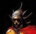
1 - Ghul
- Dread Necromancer
 Offline
- From: Isle of Ghul
- Registered: 3/01/2014
- Posts: 2,706
Retooled North Wind Logo
Since I started publishing under the North Wind Adventures brand, I've been using two logos. The first one was a simple hexagon with the company name in a narrow sans-serif font:
Simple, but a little boring.
Then came the "Sleepy Xathoqqua" image by Ian Baggley. The idea behind this logo rose up unintentionally. You see, at one point during the early development of the game, I was considering a wooden box with a laser engraved logo on the cover. I wanted to use Ian's image of the Xathoqqua eye found in the game, but without the smoky background, but Ian wanted to draw something all-new. I suggested something more tribal. By the time he finished it, I already knew I wasn't going to put the AS&SH game in a wooden box due to the exorbitant shipping costs involved. Now I had a second logo, and I didn't know what to do with it, so I started using them both on everything. Maybe not the brightest idea. Here is the Xathoqqua logo:
A very nice piece. However, in recent months I contemplated scrapping Baggley's Xathoqqua image, because despite its fine quality, I didn't feel it said anything about the brand. Ian felt it was a design that could be carried for years, representing a plethora of adventures, supplements, and so forth, but I never quite agreed, even though I liked the art. I was prepared to scrap it and start fresh. But then I came to my senses! Inspired by another (non-gaming) company's simple yet effective logo, today I spent about three hours designing the following presentation:
I think this captures exactly the sort of thing I was looking for. Vivid, distinctive art, clear and concise text, and a nice blend of contrast. Depending on the application, I could reverse the colors, too.
HYPERBOREA- A Role-Playing Game of Swords, Sorcery, and Weird Science-Fantasy
- k2h2m3
- Ruffian
Offline
- Registered: 3/04/2014
- Posts: 61
Re: Retooled North Wind Logo
I like it Jeff but I would be interested in seeing the colors reversed too.
- Ghul
- Dread Necromancer
Offline
- From: Isle of Ghul
- Registered: 3/01/2014
- Posts: 2,706
Re: Retooled North Wind Logo
Not really impressed with the inverted version, to be honest:
HYPERBOREA- A Role-Playing Game of Swords, Sorcery, and Weird Science-Fantasy
- •
- k2h2m3
- Ruffian
Offline
- Registered: 3/04/2014
- Posts: 61
Re: Retooled North Wind Logo
Yeah I think I have to agree with your assesment.
- Blackadder23
- The Thousand and First Eye
Offline

- Registered: 3/04/2014
- Posts: 1,584
Re: Retooled North Wind Logo
Please don't scrap Ian's stylized Bat-Toad! ![]() It is awesome. It also makes a different monster (sort of like an insect creature wearing a hat) if you turn it upside-down.
It is awesome. It also makes a different monster (sort of like an insect creature wearing a hat) if you turn it upside-down. ![]()
The new logo looks good. ![]()
Michael Sipe 1979-2018
Rest in peace, brother.
- Ghul
- Dread Necromancer
Offline
- From: Isle of Ghul
- Registered: 3/01/2014
- Posts: 2,706
Re: Retooled North Wind Logo
Blackadder23 wrote:
Please don't scrap Ian's stylized Bat-Toad!
It is awesome. It also makes a different monster (sort of like an insect creature wearing a hat) if you turn it upside-down.
The new logo looks good.
Thanks, BA23!
HYPERBOREA- A Role-Playing Game of Swords, Sorcery, and Weird Science-Fantasy
- •
- Chainsaw
- Warlord
Offline
- From: South of Heaven
- Registered: 3/02/2014
- Posts: 2,148
Re: Retooled North Wind Logo
Agreed, looks good.
Blackadder23: Insanely long villain soliloquy, then "Your action?"
BORGO'S PLAYER: I shoot him in the face
- Ghul
- Dread Necromancer
Offline
- From: Isle of Ghul
- Registered: 3/01/2014
- Posts: 2,706
Re: Retooled North Wind Logo
Agreed, looks good.
Thanks, Chain!
HYPERBOREA- A Role-Playing Game of Swords, Sorcery, and Weird Science-Fantasy
- •
- mabon5127
- Pure-blooded Pict
Offline

- From: Ptarmigan Rock
- Registered: 3/02/2014
- Posts: 1,239
Re: Retooled North Wind Logo
Looks great!
“How can I wear the harness of toil
And sweat at the daily round,
While in my soul forever
The drums of Pictdom sound?”
- Ghul
- Dread Necromancer
Offline
- From: Isle of Ghul
- Registered: 3/01/2014
- Posts: 2,706
Re: Retooled North Wind Logo
Looks great!
Glad you like it, Morgan! ![]()
HYPERBOREA- A Role-Playing Game of Swords, Sorcery, and Weird Science-Fantasy
- •
- DMPrata
- Magister Litterarum
Offline

- From: US
- Registered: 3/02/2014
- Posts: 293
Re: Retooled North Wind Logo
Jeff, what if you enclosed the Xathoqqua image in your original hexagon, like so?
- Ghul
- Dread Necromancer
Offline
- From: Isle of Ghul
- Registered: 3/01/2014
- Posts: 2,706
Re: Retooled North Wind Logo
That is a very interesting idea, DMP!
EDIT: The problem is still there from when I tried something similar a while ago. When you shrink it down to thumbnail size (because it's a logo that needs to be displayed sometimes quite small), the whole thing becomes too crowded, too busy, and the art (the focal point) loses some of its attraction.
Last edited by Ghul (6/29/2014 12:33 pm)
HYPERBOREA- A Role-Playing Game of Swords, Sorcery, and Weird Science-Fantasy
- •
- mabon5127
- Pure-blooded Pict
Offline
- From: Ptarmigan Rock
- Registered: 3/02/2014
- Posts: 1,239
Re: Retooled North Wind Logo
That is a very interesting idea, DMP!
EDIT: The problem is still there from when I tried something similar a while ago. When you shrink it down to thumbnail size (because it's a logo that needs to be displayed sometimes quite small), the whole thing becomes too crowded, too busy, and the art (the focal point) loses some of its attraction.
It becomes a box in a box taking up a lot of space that shrinks the Tsathoqqua image. I do like including the hex but it makes the image too small. IMHO.
Morgan
“How can I wear the harness of toil
And sweat at the daily round,
While in my soul forever
The drums of Pictdom sound?”
- Chainsaw
- Warlord
Offline
- From: South of Heaven
- Registered: 3/02/2014
- Posts: 2,148
Re: Retooled North Wind Logo
What if you removed the box, then enlarged the hex such that the bottom line is the length of the old box, with the North Wind Adventures running beneath it. Then you can make the image larger inside the hex.
Blackadder23: Insanely long villain soliloquy, then "Your action?"
BORGO'S PLAYER: I shoot him in the face
- Ghul
- Dread Necromancer
Offline
- From: Isle of Ghul
- Registered: 3/01/2014
- Posts: 2,706
Re: Retooled North Wind Logo
What if you removed the box, then enlarged the hex such that the bottom line is the length of the old box, with the North Wind Adventures running beneath it. Then you can make the image larger inside the hex.
Ha! I tried that, too. I can't find the results, because it was something I'd messed with a long time ago. This will be hard to explain in words. See, the base of the hex demands a smaller sized font for the text below it, to keep it all proportionate, so you end up having to make a larger hex just to keep the text legible, and the whole thing looks awkward. You can stack the words "north", "wind", and "adventures" each on top of each other, in order to use a larger font size, but I really like the idea of "north wind" on one line and "adventures" below it, because they have the same number of characters. I'm not sure if I'm conveying any of this very well. I guess at the end of the day, what I'm saying here is that I tried a lot of different styles, and I never found anything that I liked enough to share until I made that rectangle design yesterday. I thought I had to scrap Xathoqqua, but then I realized that all I had to do was scrap the hexagon. It doesn't bother me, because I see a lot of other gaming companies using the shape for their logo designs. Thanks for the brainstorming, fellows!
HYPERBOREA- A Role-Playing Game of Swords, Sorcery, and Weird Science-Fantasy
- •
- Chainsaw
- Warlord
Offline
- From: South of Heaven
- Registered: 3/02/2014
- Posts: 2,148
Re: Retooled North Wind Logo
Sounds like fun... NOT!
I like the box with the picture and words underneath just fine. ![]()
Blackadder23: Insanely long villain soliloquy, then "Your action?"
BORGO'S PLAYER: I shoot him in the face
- Ghul
- Dread Necromancer
Offline
- From: Isle of Ghul
- Registered: 3/01/2014
- Posts: 2,706
Re: Retooled North Wind Logo
I'm not even sure what I said in the previous post, but I'm glad you concur. ![]()
HYPERBOREA- A Role-Playing Game of Swords, Sorcery, and Weird Science-Fantasy
- •
- joseph
- Sorcerer-King of Lemuria
Offline

- From: Poland, OH
- Registered: 3/04/2014
- Posts: 326
Re: Retooled North Wind Logo
The new logo looks good, and you have answered the question as to why each product had two logos. Well done Jeff!
ravengodgames.blogspot.com ~ cartography, writing, game design
Author, Forgotten Fane of the Coiled Goddess
- Benoist
- Ruffian
Offline

- Registered: 3/03/2014
- Posts: 69
Re: Retooled North Wind Logo
It looks good! A logo should be simple, straightforward, catch the attention and instinctively say something about the company. I think this logo accomplishes all of that.
Last edited by Benoist (6/30/2014 9:58 am)
That Guy With A French Accent. YouTube Channel
The Hobby Shop Dungeon
GP Adventures Old School Role-Playing Community
- Kirowan
- Vagabond
Offline
- From: Boise, ID, USA
- Registered: 6/02/2014
- Posts: 11

Re: Retooled North Wind Logo
Looks great.

© 2009-2026 North Wind Adventures, LLC. “HYPERBOREA” is a registered trademark of North Wind Adventures, LLC. “Astonishing Swordsmen & Sorcerers of Hyperborea,” “AS&SH,” and all other North Wind Adventures product names and their respective logos are trademarks of North Wind Adventures, LLC in the USA and other countries. ALL RIGHTS RESERVED.